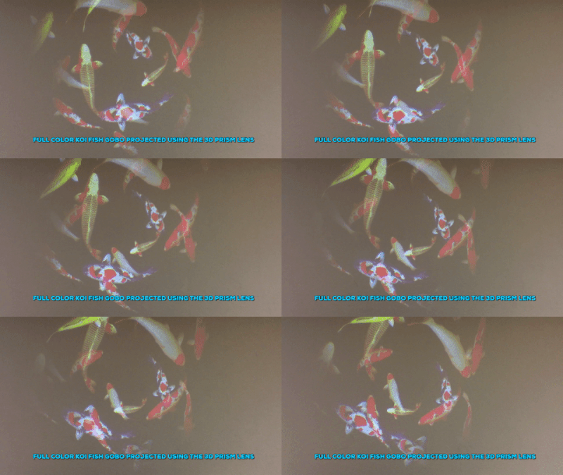
Custom color gobos are perfect for logos, event decor, product promotion, and any full-color design that you’d like to translate into a projected image. Especially for a logo, it’s important to match the colors as closely as possible, but it’s not as simple as just indicating the Pantone equivalent. When you add projection to the equation, color matching becomes a complex art.
Color gobos are created by stacking thin layers of dichroic glass in different combinations until a close match is found. This meticulous process requires the discerning eye of a professional with both gobo and lighting expertise. It’s not enough to just find a winning combination of color glass plates, you also have to take into account a variety of variables that will affect the final projected gobo. While there may be no such thing as a perfect match when it comes to color gobos, you can help ensure the best results with a few simple preparations.
Here are 5 tips color matching tips for custom gobos:
1. Choose Glass Gobos
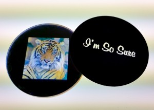
Glass provides the highest quality image for the widest variety of applications. Laser or chemical etching allows for accurate translation of intricate designs and custom fonts, even onto the smallest gobo sizes. While film and plastic gobos do offer color options, these materials only work in low power projectors and still warp or fade over time which alters the color.
Related Post: The Difference Between Glass, Metal, and Film Gobos
2. Don’t Expect a Pantone Match
The Pantone color wheel translates accurately to print only. Even on calibrated computer screens the color can look different. It gets even more complicated with gobo projections as the colors are produced using an entirely different process compared to print or regular plastic filters. We can match Pantone colors as closely as possible within the limitations of projection but it’s important that gobo customers understand there’s no such thing as a guaranteed perfect match. We have a huge inventory of color glass waivers (the blank coated gobo disks we use to make the final gobo) allowing us to combine a wide range of shades and find a suitable match.
3. Understand the Variables
There are multiple variables that can alter the appearance of a color. Some can be mitigated but others are harder to avoid. These variables include:
Color Temperature of the Projector
Color temperature describes the “whiteness” of light given off by different types of bulbs or lamps. For instance, incandescent lamps and halogen lamps produce a warm, yellowish light whereas some discharge bulbs and LEDs produce very white, almost blue light. The “whiteness” of a light bulb is referred to as its color temperature, measured in degrees of Kelvin on a scale of 1,000 to 10,000. Only certain gobo colors, especially purples, pinks, and whites, are affected by color temperature. For example, a purple logo might look fine when projected using “warm” halogen lamp but if your projector uses a “cool” LED lamp the logo may appear pink.
Ambient lighting
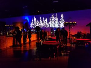
The ambient lighting also alters colors. Think about how the color of your clothing can look different under artificial light versus natural light. Fluorescent and incandescent lighting both have different effects as well on the resulting projection.
Projection surface
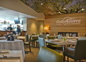
Will you be projecting your gobo onto a wood floor or a white wall? A dark versus a light surface will result in starkly different projections, so know in advance where you plan to project the gobo and notify your designer. Even projection screens alter certain colors, like purples, pinks and whites.
4. Provide High-Quality Artwork
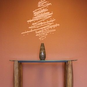
Complex, intricate designs translate well onto glass gobos but only if the original artwork is a crisp, clean image in high resolution. Providing high-quality artwork ensures that each detail and color translates as intended onto the gobo. Not sure what qualifies a high-quality image? Review our artwork guidelines to ensure you meet quality standards, formatting, and submission requirements.
5. Set Realistic Expectations

As a DJ or event planner, it’s important to educate your clients about color matching as well. Setting realistic expectations up front can avoid costly redos (that may not even achieve the desired results), and always results in happier customers. Ask for high-quality artwork, push for glass gobos, and make it clear that projections always appear slightly different than colors in print or online.
There’s no such thing as a perfect match
When ordering a custom color glass gobo, remember to keep in mind that there’s no such thing as a perfect match. Print colors simply don’t translate exactly to projection but color gobo experts can get really close. Always provide as much information as possible to your gobo designer, such as the surface color, ambient lighting, and the type of projector and bulb you plan to use. Detailed information about your lighting setup combined with high-resolution artwork will get you closer to a perfect color match.
Related reading:
Your marketing solution for trade shows, conferences, and corporate events
Gobo motion effects 101: How to add motion to gobo projections
The difference between glass, metal, and film gobos
Want to make sure you don’t miss new product releases, gobo lighting tips, and special deals?
Subscribe to our Newsletter
